

|
| |
| Dr. J. M. Brayer | ||
|---|---|---|
The definitons of the transform (up to expansion coefficients) and
the inverse transform are given below:

and
where u = 0,1,2,...,N−1;
v = 0,1,2,...,N−1;
x = 0,1,2,...,N−1;
y = 0,1,2,...,N−1; and
j = √−1.
First we will investigate the "basis" functions for the Fourier Transform (FT). The FT tries to represent all images as a summation of cosine-like images. Therefore images that are pure cosines have particularly simple FTs.
 |
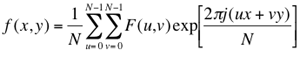
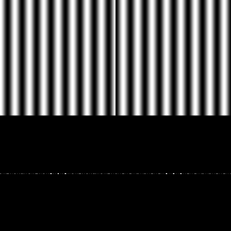
This shows 2 images with their Fourier Transforms directly underneath. The images are a pure horizontal cosine of 8 cycles and a pure vertical cosine of 32 cycles. Notice that the FT for each just has a single component, represented by 2 bright spots symmetrically placed about the center of the FT image. The center of the image is the origin of the frequency coordinate system. The u-axis runs left to right through the center and represents the horizontal component of frequency. The v-axis runs bottom to top through the center and represents the vertical component of frequency. In both cases there is a dot at the center that represents the (0,0) frequency term or average value of the image. Images usually have a large average value (like 128) and lots of low frequency information so FT images usually have a bright blob of components near the center. Notice that high frequencies in the vertical direction will cause bright dots away from the center in the vertical direction. And that high frequencies in the horizontal direction will cause bright dots away from the center in the horizontal direction.
 |
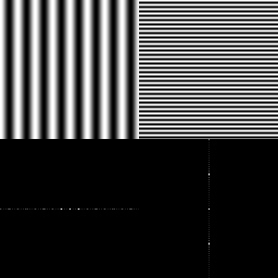
Here are 2 images of more general Fourier components. They are images of 2D cosines with both horizontal and vertical components. The one on the left has 4 cycles horizontally and 16 cycles vertically. The one on the right has 32 cycles horizontally and 2 cycles vertically. (Note: You see a gray band when the function goes through gray = 128 which happens twice/cycle.) You may begin to notice there is a lot of symmetry. For all REAL (as opposed to IMAGINARY or COMPLEX) images, the FT is symmetrical about the origin so the 1st and 3rd quadrants are the same and the 2nd and 4th quadrants are the same. If the image is symmetrical about the x-axis (as the cosine images are) 4-fold symmetry results.

 |
Note that the FT images we look at are just the magnitude images. The images displayed are horizontal cosines of 8 cycles, differing only by the fact that one is shifted laterally from the other by 1/2 cycle (or by π in phase). Note that both have the same FT magnitude image. The phase images would be different, of course. We generally do not display phase images because most people who see them shortly thereafter succomb to hallucinogenics or end up in a Tibetan monastery. Nevertheless, it is wise to remember that when one looks at a common FT image and thinks about "high" frequency power and "low" frequency power, this is only the magnitude part of the FT.
By the way, you may have heard of the FFT and wondered if was different from the FT. FFT stands for "Fast" Fourier Transform and is simply a fast algorithm for computing the Fourier Transform.
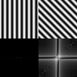 |
At first, the results seem rather surprising. The horizontal cosine has its normal, very simple FT. But the rotated cosine seems to have an FT that is much more complicated, with strong diagonal components, and also strong "plus sign" shaped horizontal and vertical components. The question is, where did these horizontal and vertical components come from? The answer is that the FT always treats an image as if it were part of a periodically replicated array of identical images extending horizontally and vertically to infinity. And there are strong edge effects between the neighbors of such a periodic array as can be seen by:
 |
Thus, what we see as the FT in the "slant" image (lower right of the image before last) is actually the combination of the actual FT of the cosine function and that caused by the edge effects of looking at a finite part of the image. These edge effects can be significantly reduced by "windowing" the image with a function that slowly tapers off to a medium gray at the edge. The result can be seen by:
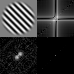 |
The windowed image is shown in the upper left. Its FT is shown in the lower left. The non-windowed FT is shown in the upper right and the actual, true FT of a cosine is shown in the lower right. These images are all scaled differently and the comparison is only qualitative, but it can be seen that the windowed image FT is much closer to the true FT and eliminates many of the edge effects.
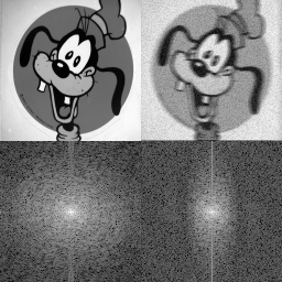 |
There are 2 images, "goofy" and the degraded "goofy", with FTs below each. Notice that both suffer from edge effects as evidenced by the strong vertical line through the center. The major effect to notice is that in the transform of the degraded goofy the high frequencies in the horizontal direction have been significantly attenuated. This is due to the fact that the degraded image was formed by smoothing only in the horizontal direction. Also, if you look carefully you can see that the degraded goofy has a slightly larger background noise level at high frequencies. This is difficult to see and perhaps not even meaningful because the images are scaled differently, but if really there, it is due to the random noise added to the degraded goofy. Notice also that it is difficult to make much sense out of the low frequency information. This is typical of real life images.
The next images show the effects of edges in images:
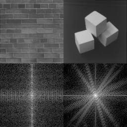 |
Notice the strong periodic component, especially in the vertical direction for the bricks image. Horizontal components appear closer together in the FT. In the blocks image, notice a bright line going to high frequencies perpendicular to the strong edges in the image. Anytime an image has a strong-contrast, sharp edge the gray values must change very rapidly. It takes lots of high frequency power to follow such an edge so there is usually such a line in its magnitude spectrum.
Now lets look at a bunch of different shapes and their FTs.
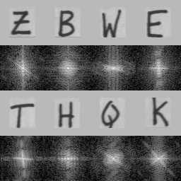 |
Notice that the letters have quite different FTs, especially at the lower frequencies. The FTs also tend to have bright lines that are perpendicular to lines in the original letter. If the letter has circular segments, then so does the FT.
Now lets look at some collections of similar objects:
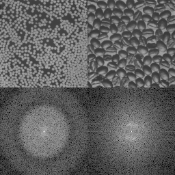 |
Notice the concentric ring structure in the FT of the white pellets image. It is due to each individual pellet. That is, if we took the FT of just one pellet, we would still get this pattern. Remember, we are looking only at the magnitude spectrum. The fact that there are many pellets and information about exactly where each one is is contained mostly in the phase. The coffee beans have less symmetry and are more variably colored so they do not show the same ring structure. You may be able to detect a faint "halo" in the coffee FT. What do you think this is from?
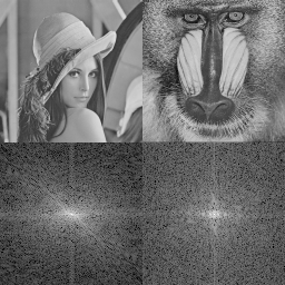 |
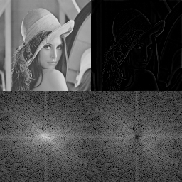
Here are our first truly general images. Notice there is very little structure. You can see a top left to bottom right slanting line in the girl image FT. It is probably due to the edge between her hat and her hair. There are also some small edge effects in both images. The mandril image appears to have more high frequency power, probably due to the hair.
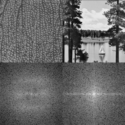 |
The seafan image has a lot of little holes that are about the same size and somewhat randomly oriented. The size of the holes is about 2 pixels wide so that corresponds to frequency components about 1/2 way out to the maximum. The strong horizontal components in the lake image is probably due to the tree trunk edges.
Now, here is your first quiz. Consider an image that is all black except for a single pixel wide stripe from the top left to the bottom right. What is its FT? Also, consider an image that is totally random. That is, every pixel is some random value, independent of all other pixels. What is its FT?
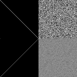 |
Do you believe it? If not, you can check it yourself. By the way, notice the single bright dot in the middle of the noise FT image. Why is it there? Why does the noise FT look dark gray?
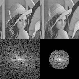 |
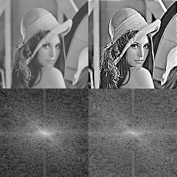
The upper left image is the original image. The lower left is its magnitude spectum produced by FT. The lower right is then produced by rejecting all frequency components outside a circular low-frequency region, and finally, the upper right is produced by the inverse FT.
The FT on the left side of the image have been discussed before. In the lower right, notice how sharply the high frequencies are cut off by the "ideal" lowpass filter. Notice also that not very much power is being thrown away beyond the circle that is cut off. In the upper right, the reconstructed image is obviously blurrier due to the loss of high frequencies. Overall contrast is still pretty good due to that fact that not too much power was thrown away. Notice also that there are obvious "ringing" artifacts in the reconstructed image. This is due to the very sharp cutoff of the "ideal" filter. A low-pass filter which does not cut off but only gradually suppresses the higher-frequency components would not cause these.
Now we will do a highpass filter. The following image is produced in the same way as the previous one except that the lower-frequency components are suppressed.
 |
Notice in the lower right that this filter does not cut off sharply at the 50% point as the previous lowpass filter did. However, the center bright spot, which accounts for most of the power in the image, is clearly gone. The image in the upper right, which looks totally black, in fact is not totally black: by stretching the gray values from 0-20 out over the entire range, you can see that this highpass filter has preserved the image information where there are very rapid changes in gray level:
 |
Such a process is frequently what is desired in an edge detector. However, it is not an improvement in the image. There are two problems. First, it is too dark. This can be fixed by rescaling or re-contrast- stretching the image after filtering. This is commonly done and is easy. Second, and harder, is the fact that too much of the low frequency tonal information is gone.
Image sharpening requires a "sharpening" filter or high frequency emphasis filter. This kind of filter preserves some of the low frequency information but relatively boosts the higher frequencies. To do such a thing, let us construct a piecewise-linear filter which is circularly symmetrical, multiplies Fourier coefficients of frequency-distance 0 from the origin by 0.5, then away from the origin or zero frequency out to frequency-distance 96, the multiplier is interpolated between 0.5 and 4.0, and from then outward, the multiplier is 4.0. So higher frequency coefficients are multiplied by values greater than 1.0 and lower frequency coefficients are multiplied by values less thatn 1.0. The overall net effect on the image power is that it is unchanged. The rest of the image is constructed as before. To see the result:
 |
Notice the relative brightness at high frequencies in the lower right image. Which upper image is sharper? Which upper image looks better? Portraits are one of the few contradictions to the general principal that sharper is better.
Filtering can also be used to reduce noise. It is particularly effective when the noise is confined to just a few frequencies:
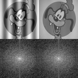 |
The image on the upper left is "goofy" with a superimposed cosine added to it, representing noise. In the lower left, notice the strong cosine "dots" just to the left and right of the origin. In the lower right, these "dots" have been removed by a specially designed filter. The filtered spectrum is fed to the inverse FT to get the upper right image where the cosine "noise" is gone.
Life is not always this easy as is shown in the next example:
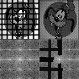 |
In this case, a grid has been placed over "goofy". The lower left shows the resulting FT. Notice that the grid is quite sharp so it has lots of high frequencies so its impact on the frequency domain is very spread out. A piecewise-rectangular rejection is used to cut out the grid frequencies as much as possible. The right half of the lower right image has not cuts because it is the symmetric reflection of the left half and is not used by the filter.